# Colors
### General
Site administration -> Appearance -> Scholastica -> Customization -> General
1. Body Background Color
2. Border Color (Global)
3. **Button Border Radius (px):** Make edits to adjust the roundness of buttons, forms, and other elements.
### **Text Colors**
Compatible with WCAG Principles. Change only when you really need to.
#### Available options
* Text Color
* Text Color (Secondary)
* Text Color (Light)
* Link Color
* Link Color (Hover)
### UI Colors
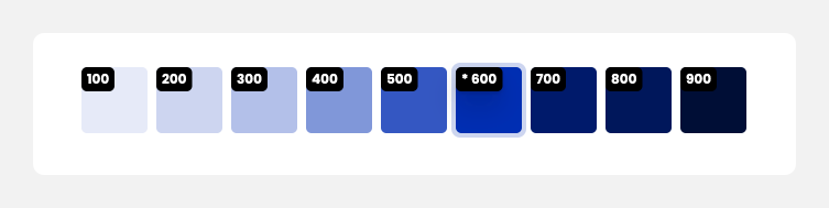
### Primary Color
To generate automatically the color palette just set up the **"Main Theme Color - 600".** \
Add a custom HEX color value to the field if you want to change any color from the palette.\
\&#xNAN;*Regarding: Primary buttons, top bar navigation, and all other essential UI elements.*
### Grays
I used gray shades compatible with WCAG Principles. Change only when you really need to.\
\&#xNAN;*Regarding: Interface elements such as secondary buttons, borders, shades, and other components designed with shades of gray.*